HTC’s splurge of product announcements has taken in a massive five smartphones at MWC – the Desire S, Wildfire S, and the flagship Incredible S, plus a pair of “Facebook” phones in the Salsa and Chacha (more on these later). Yet the most exciting announcement by far has to be the firm’s first Android tablet: the Flyer.
Unlike the majority of its rivals, HTC has been beavering away on its own skin for Android – Sense For Tablets – and it looks to have been hard at work on the hardware too. The HTC Flyer boasts a 7in 1,024 x 600 screen, a single-core 1.5GHz processor, 1GB of RAM, 32GB of storage, a 5-megapixel camera capable of shooting HD video and a front-facing camera. There’s 14.4Mbits/sec HSDPA, 802.11n Wi-Fi, Bluetooth 3 with A2DP, GPS and all the usual sensors.
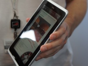
I’ll take a deep breath and then continue, because that’s not all. With the Flyer is included a pressure-sensitive capacitive stylus, which we saw used to scrawl notes in HTC’s note-taking app and then shared using Evernote, which comes pre-installed. Dubbed the HTC Scribe, the stylus has a couple of buttons on its body, one of which is used to switch to highlight text, while the other is used for erasing.
HTC’s Timemark technology, meanwhile, lets you record audio at the same time as writing notes by hand on the screen – like a screen-based version of a Pulse Smartpen. Oddly, and that’s putting it kindly, there’s nowhere in the Flyer’s 13.2mm thick body to stow the stylus.
Design-wise, the Flyer looks to be the best of the bunch so far. Just as with the Legend and countless MacBooks before it, the Flyer has a aluminium unibody chassis, which looks very smart indeed, and it’s iced smartly with white plastic highlights. It measures 122 x 13.2 x 195.4mm (WDH) and weighs an iPad-spanking 415g. It’s a world away from the chunky Samsung Galaxy Tab in terms of looks, and really heralds the arrival of Android tablets in the big time.
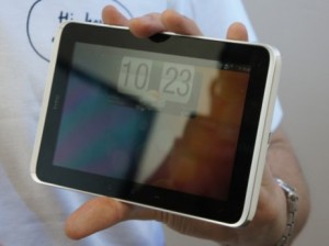
We’re not too sure about HTC’s reliance on the Sense UI, however. Turn on the Flyer and you’re greeted by HTC’s familiar Sense homescreen, dominated by the flippy clock at the top and soft buttons at the bottom of the screen. Rotate it and the desktop rearranges itself neatly into a slightly less attractive landscape view. You can pinch to zoom out and view the device’s seven desktops, just as you can with any of the firm’s smartphones – it feels homely, like a pair of well-worn slippers.
Rather than being build on top of Google’s forthcoming (and tablet-specific) Android 3 OS, however, Sense for tablets has been pasted over Android 2.4, which seems to be a retrograde step. Here we have an Android tablet, with modern styling, but sporting an underlying OS designed for smartphones, not tablets. Whether this will prove to be a hindrance to the success of the Flyer waits to be seen.
All-in-all, though, the Flyer looks to be off to a good start here. It will be available in Q2, along with all the other smartphones announced this morning, and should at last provide Apple and Samsung with the sort of challenge we’ve all been waiting for. Keep an eye on the blog for more first looks as the day progresses.
Posted on February 15th, 2011 by Jonathan Bray


