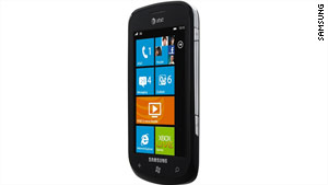
Windows Phone 7, Microsoft’s complete do-over of its mobile operating system, is off to a promising start with the Samsung Focus.
Despite a few imperfections with usability and web browsing, the big M has polished a gem with this OS, and it truly shines through this iPhone lookalike’s beautiful display.
The Focus feels slick and smooth the first time you pick it up. It’s a teensy bit longer, wider and thicker than the iPhone 4 (4.84 x 2.56 x 0.39 inches compared with the iPhone 4’s 4.5 x 2.31 x 0.37 inches).
And the Focus is lighter at 4.07 ounces, versus the iPhone 4’s 4.8 ounces. Holding it in your hand, you can tell the Samsung phone’s plastic parts are a bit cheaper than Apple’s luxury glass-and-metal components.
That’s not to say the Focus isn’t a sweet device, though: The vivid Super AMOLED display makes Windows Phone 7’s colorful tile-based interface a visual treat.
Selecting a tile brings you into a “hub” containing integrated experiences for different features. For example, the Marketplace hub displays the four different software stores where you can purchase media: third-party apps, games, music and Samsung Zone, a separate app store serving software made by Samsung.
You can move tiles around on the home screen to suit your preferences just by holding your finger over them and dragging.
The tile interface is plenty intuitive, so you probably won’t need an instruction manual when you’re setting up the phone.
The People tile is pretty fun: It blends your contacts list with your Facebook account. When you dial a friend’s number, his or her Facebook mug appears next to the call. Selecting a contact brings up the person’s phone number, e-mail address and Facebook profile all in one screen. Pretty neat.
The Mail hub is especially impressive. You select your service (Hotmail, Google Mail, Yahoo! and others), enter your login info and boom — the inbox is a tile on your home screen.
The e-mail app in general looks great: Facebook integration comes into play here, too, so when you load an e-mail it’s accompanied with the sender’s Facebook portrait as well. To me, this visual experience makes e-mail far less boring.
For transferring music, photos and video you can sync media from your computer to the Focus with a USB cable. I tested syncing on a Mac. The official syncing program for Mac users isn’t available yet, but I had a chance to try the beta version, and it was surprisingly smooth at syncing music from my iTunes library and photos and video from iPhoto.
(Don’t get your hopes up, though: This is a feature that Apple is most likely going to break with future iTunes updates, just like it did with the Palm Pre’s iTunes sync feature.)
As for snapping photos, there’s a dedicated shutter button on the right side of the phone to load the camera app and to take a picture. In the Photo hub, you can also enable pictures to automatically sync to a free SkyDrive folder stored online in your Hotmail account, sparing you the need to manually upload them.
Overall, this entire camera experience is a lot snappier than photo features on the iPhone and Android devices. However, the pictures shot with the Focus’s 5-megapixel camera are only passable, and are a little blurry even in good lighting conditions.
With all that said, there were a few minor gripes that drove me a bit crazy.
To wake up the phone, you have to press the physical power button on the right side. It feels unnatural to have to grip the phone and push a button on the side whenever you want to quickly check an e-mail or send a text message.
I wish you could power on the device just by pressing the main menu button, which is centered under the screen — similar to how you can press the iPhone’s Home button to turn it on.
And then there’s the mobile version of Internet Explorer. It’s not as bad as Microsoft’s desktop browser, but it’s not much better.
The mobile browser doesn’t seem to load text properly on some websites, such as Reddit and Digg. Small text doesn’t render smoothly, which is evident even when loading Wired.com. Also, photos on some websites appear over-sharpened, making rough pixels become visible. Long story short, two thumbs down for Internet Explorer.
Oh, yeah — and just like the iPhone, there’s no support for Adobe Flash on Windows Phone 7 (yet), so Hulu junkies won’t be thrilled.
The phone seemed more reliable at holding a call than the iPhone 4, but it wasn’t any better at pulling in a signal in areas where AT&T’s coverage is weak (like San Francisco’s Mission District). My testing was hardly scientific, though.
Texting is surprisingly fast on the Focus. Hitting Send shoots out a text almost instantly. There’s no progress bar or anything. Why can’t the iPhone do that?
Overall, the Samsung Focus is a solid all-around device, and the pros heavily outweigh the cons. Most of the listed problems will probably be fixed in software updates. And with Windows Phone 7, Microsoft has largely redeemed itself after putting that bloated carcass known as Windows Mobile to rest. Rest in peace — and good riddance — WinMo.
Gorgeous tile-based UI laced with large, smooth text doesn’t rip off the iPhone’s app interface. Provides a rich dose of social savvy thanks to tight Facebook integration. Physical camera shutter button is a nice shortcut for shooting quick photos.
TIRED Internet Explorer lives up to its super-lame reputation. Camera shots too blurry to be taken seriously.
Courtesy : WIRED


